
Maison aux Pois
Year:
Industry:
Services:
2020
Drink
Brand strategy, Visual identity, Photo concept, Name
During the project, we built an identity that consciously distances itself from the usual visual world of wineries.
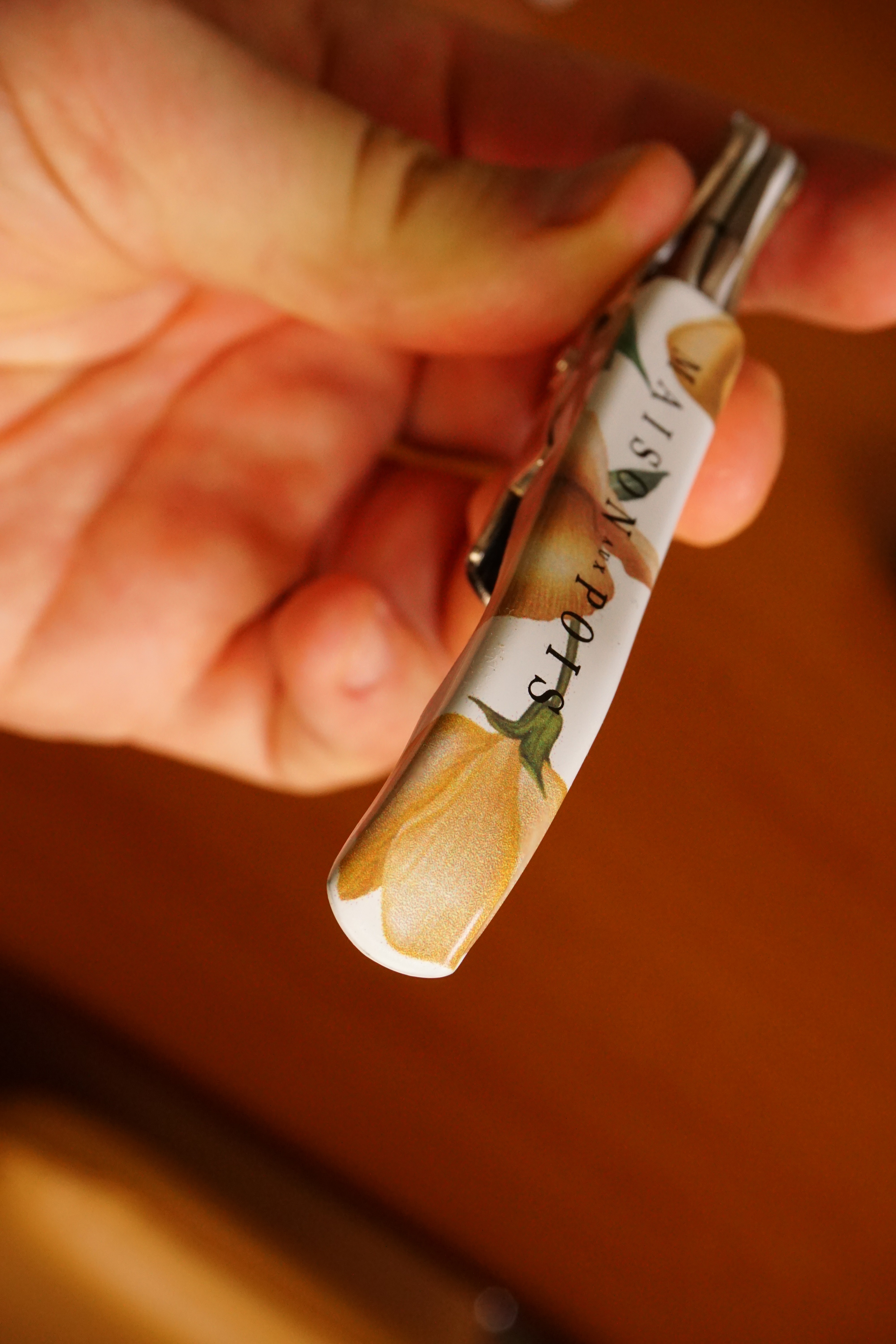
For Maison aux Pois, we created an entirely new brand world, from the naming and visual identity to the packaging. The light, French character of the young winery in the Tokaj-Hegyalja region and the personal story of the founders inspired the name Maison aux Pois, as well as the pea flower, which became the brand's defining visual motif. During the project, we built an identity that consciously distances itself from the conventional visual world of wineries.
The delicate illustrations, soft colours and detailed graphic elements have created a light, elegant and easily recognisable brand character that tells as much about the wines as about the people behind them.




" height="101.49938483554524px" id="Ic75VkNQ4" width="811.000040863664px"/></svg>)
Maison aux Pois
Year:
Industry:
Services:
2020
Drink
Brand strategy, Visual identity, Photo concept, Name
During the project, we built an identity that consciously distances itself from the usual visual world of wineries.
For Maison aux Pois, we created an entirely new brand world, from the naming and visual identity to the packaging. The light, French character of the young winery in the Tokaj-Hegyalja region and the personal story of the founders inspired the name Maison aux Pois, as well as the pea flower, which became the brand's defining visual motif. During the project, we built an identity that consciously distances itself from the conventional visual world of wineries.
The delicate illustrations, soft colours and detailed graphic elements have created a light, elegant and easily recognisable brand character that tells as much about the wines as about the people behind them.
Maison aux Pois
Year:
Industry:
Services:
2020
Drink
Brand strategy, Visual identity, Photo concept, Name
During the project, we built an identity that consciously distances itself from the usual visual world of wineries.
For Maison aux Pois, we created an entirely new brand world, from the naming and visual identity to the packaging. The light, French character of the young winery in the Tokaj-Hegyalja region and the personal story of the founders inspired the name Maison aux Pois, as well as the pea flower, which became the brand's defining visual motif. During the project, we built an identity that consciously distances itself from the conventional visual world of wineries.
The delicate illustrations, soft colours and detailed graphic elements have created a light, elegant and easily recognisable brand character that tells as much about the wines as about the people behind them.